Design System
Color Contrast Checker
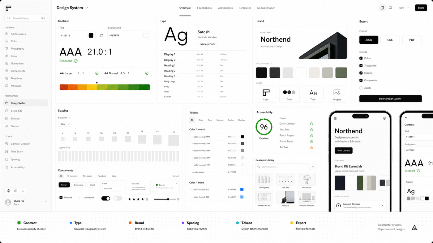
Color Contrast Checker is a practical design system workspace for brand designer teams who need a working tool, reference pages, exportable notes, and SEO-ready guidance in one static site.
Explore the product
Guides
Color Contrast Checker guides for practical workflows, review notes, and implementation decisions.
Reference hubLibrary
Color Contrast Checker reference notes, terms, and working definitions.
Template hubTemplates
Reusable Color Contrast Checker templates for briefs, tables, checklists, and exports.
Decision hubCompare
Compare common design system workflows before running the tool.
QA hubChecklists
Operational checklists for Color Contrast Checker.
SaaS roadmapPlans
Free static scope and future SaaS roadmap for Color Contrast Checker.
Popular guides
Check Color Contrast Guide
Color Contrast Checker guide for brand designer teams who need to check color contrast without losing track of weak type hierarchy.
Design System guideBuild A Type Scale Guide
Color Contrast Checker guide for UI lead teams who need to build a type scale without losing track of missing brand usage notes.
Design System guideDraft A Brand Kit Guide
Color Contrast Checker guide for accessibility reviewer teams who need to draft a brand kit without losing track of poor mobile fit.
Design System guideDefine Spacing Tokens Guide
Color Contrast Checker guide for marketing designer teams who need to define spacing tokens without losing track of unclear component state.
Design System guideCompare Component Options Guide
Color Contrast Checker guide for frontend developer teams who need to compare component options without losing track of contrast failure.
Design System guideExport Design Notes Guide
Color Contrast Checker guide for creative director teams who need to export design notes without losing track of inconsistent spacing.